Client

Fruicy

Services

Logo creation
Branding
Print

Fruicy

Fruicy is fresh, bold, and unapologetically different. This new ice cream brand blends the indulgence of a creamy treat with the natural punch of real fruit. No added sugars, no artificial stuff—just juicy, fruity goodness straight from nature.

It’s ice cream with attitude. Fruicy is fruity, juicy, and yes—sexy. From the playful flavors to the irresistible act of licking that perfect scoop, every detail is designed to tease the senses. The brand is youthful, cheeky, and full of humor, while still standing strong on quality and health.

Whether you’re a health-conscious snacker or just craving something fun and fresh—Fruicy melts expectations.

The brief

The client approached me with a clear yet ambitious goal: to create an ice cream brand that would break conventions and capture attention instantly. Fruicy needed to be more than just another “healthy” product—it had to feel different. Sexy, fruity, youthful, and above all: real.

They wanted to stand out in a saturated market by combining playful visuals with a no-nonsense promise: no added sugars, just real fruit and full flavor. I was brought on board to develop the full visual identity from scratch—one that would radiate attitude, energy, and fun, while still highlighting the healthy, honest roots of the brand.

Strategy

At the core of Fruicy lies a strong contrast: it’s indulgent, but natural; bold, but clean. This became the heart of the concept.The strategy was to embrace this tension and make it visually irresistible. We crafted a brand that flirts with the senses—through fruity imagery, cheeky language, and a vibrant aesthetic that appeals to a young, modern audience. The tone had to be confident and humorous, with just the right amount of edge. From naming to color choices, everything was designed to communicate one message: ice cream can be healthy, fun, and sexy—all at once.

Process

The creative process started with in-depth research into visual trends within food, fashion, and youth culture. From there, I developed moodboards, explored typography that felt juicy and energetic, and experimented with color palettes that reflected the fruit-forward nature of the brand.

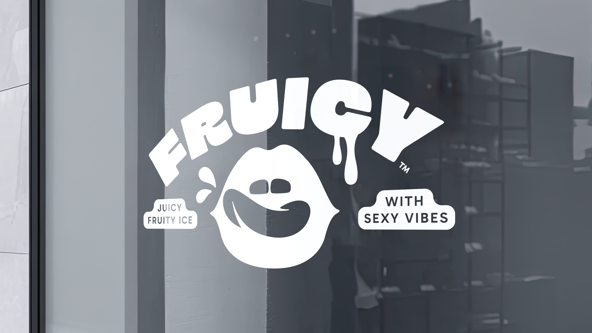
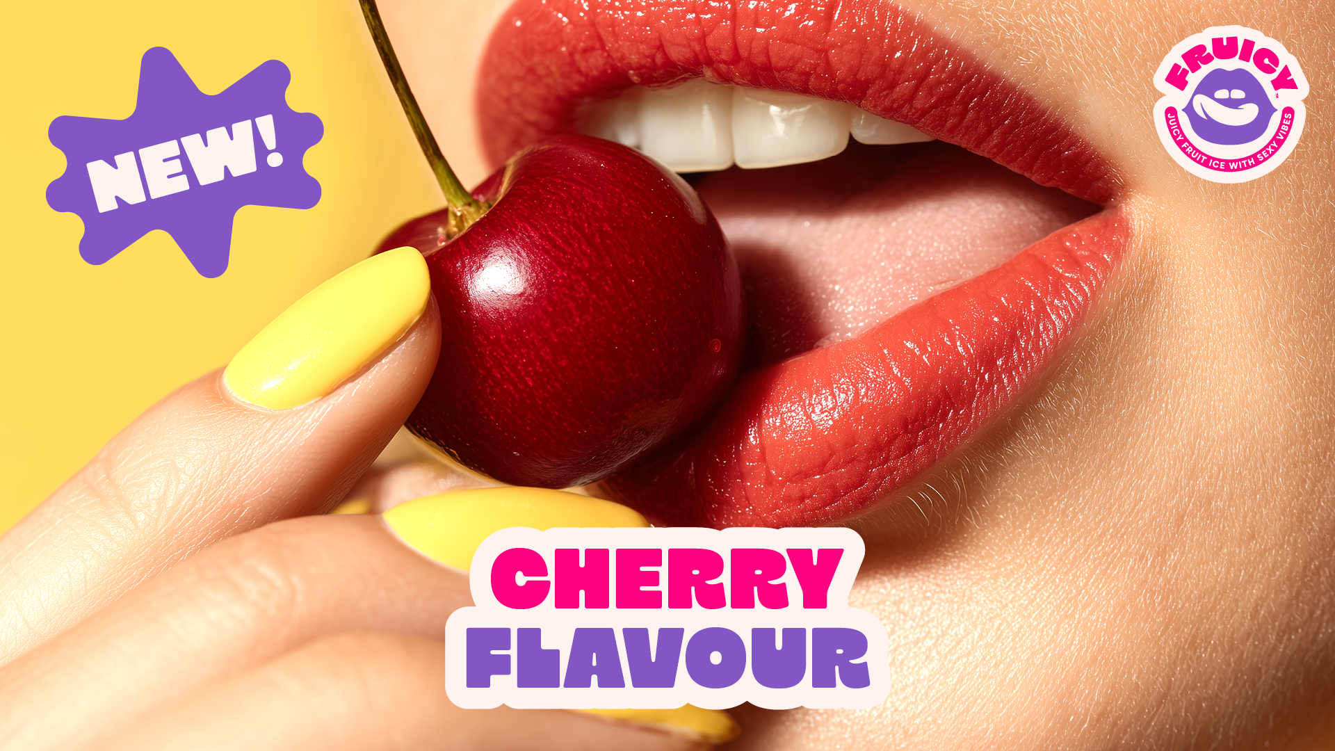
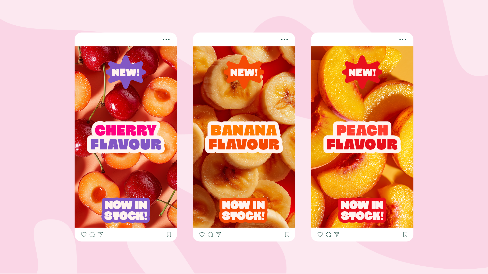
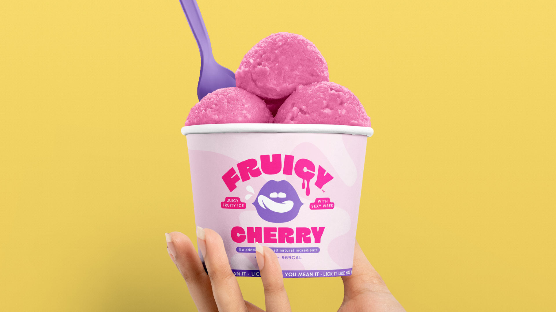
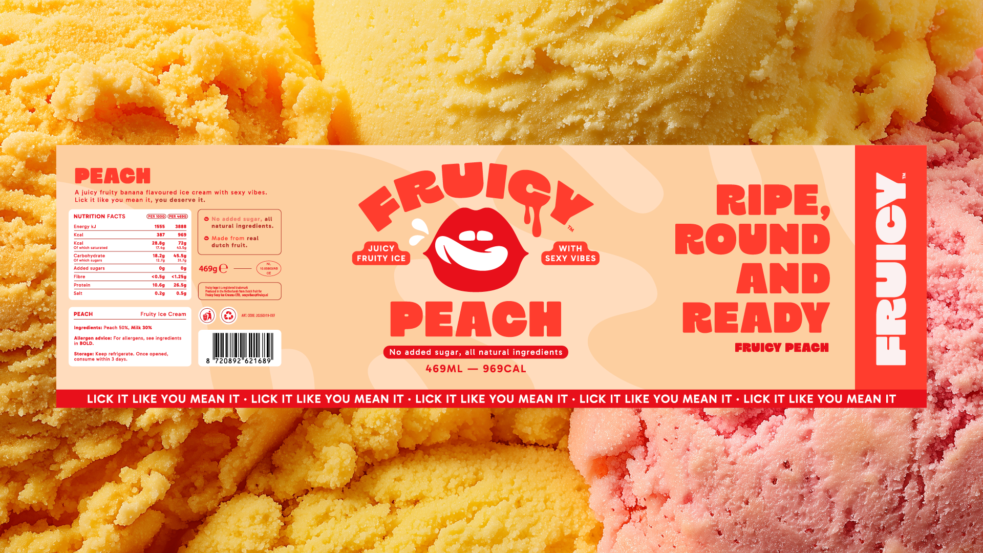
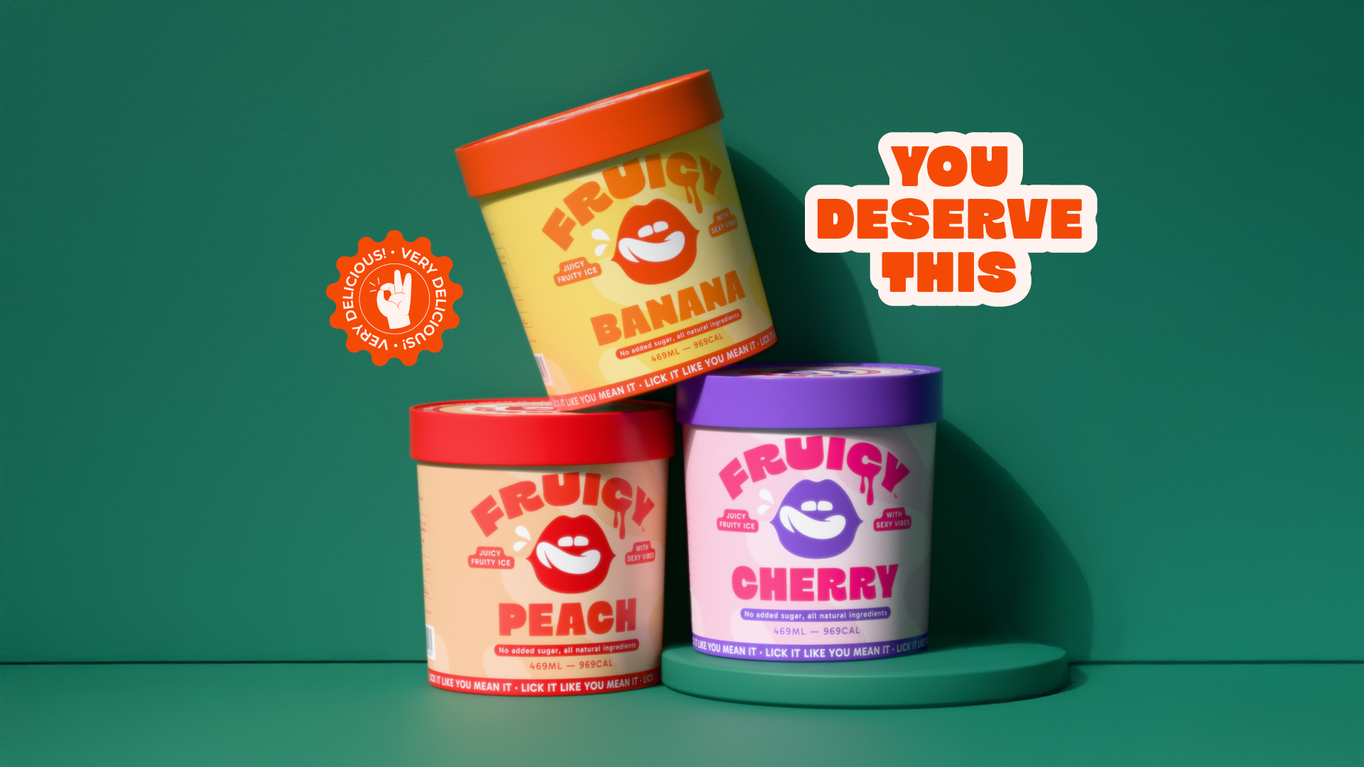
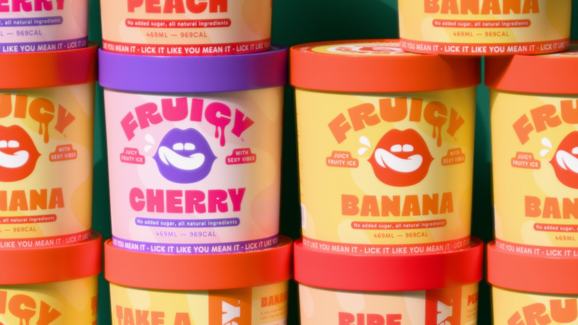
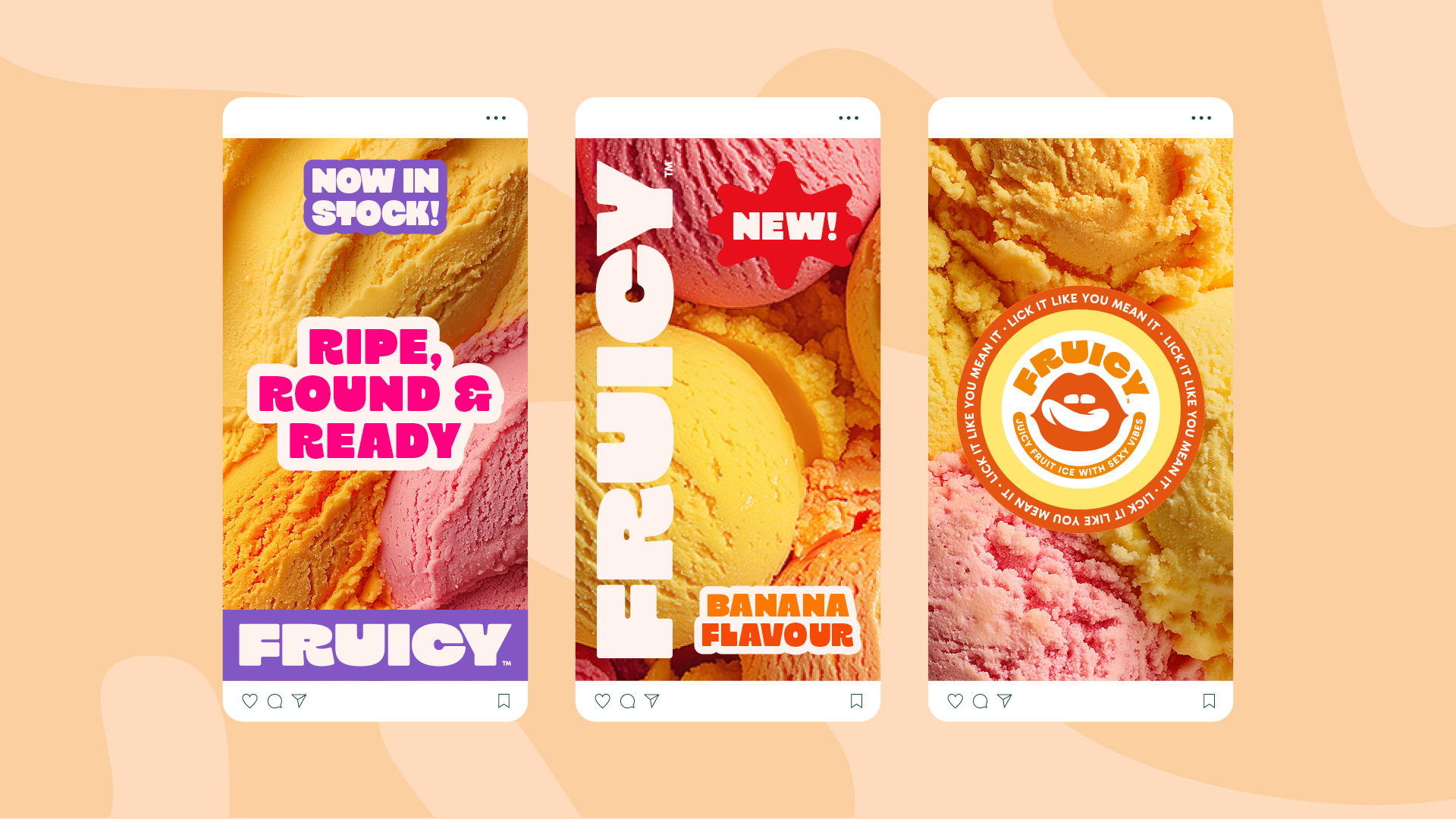
We tested playful versus polished directions, always coming back to what made Fruicy stand out: its unique combination of cheekiness and authenticity. I created a flexible design system, including a custom wordmark, vibrant packaging layouts, and social templates that would allow the brand to grow. Every visual choice was intentional, aligning with the overall vibe of fresh, fruity, and full of flavor.

Results

The end result is a brand that delivers on every level. Fruicy now has a strong, cohesive identity that grabs attention and tells a story—one that feels fun, confident, and refreshingly honest.

The visual system is designed to be bold and adaptable, allowing the brand to expand across packaging, digital platforms, and in-store presence without losing its personality. The client was thrilled with the final outcome, and Fruicy is now ready to make its mark in the market as a standout player in the world of modern, health-conscious treats. The designs not only reflect the product’s playful edge—they amplify it.
Custom Cursor + Glass Hover
View