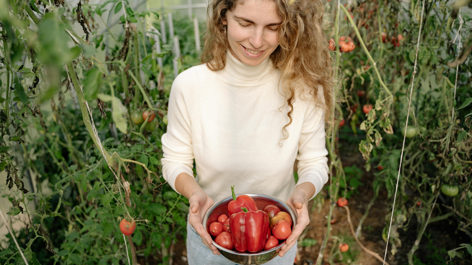
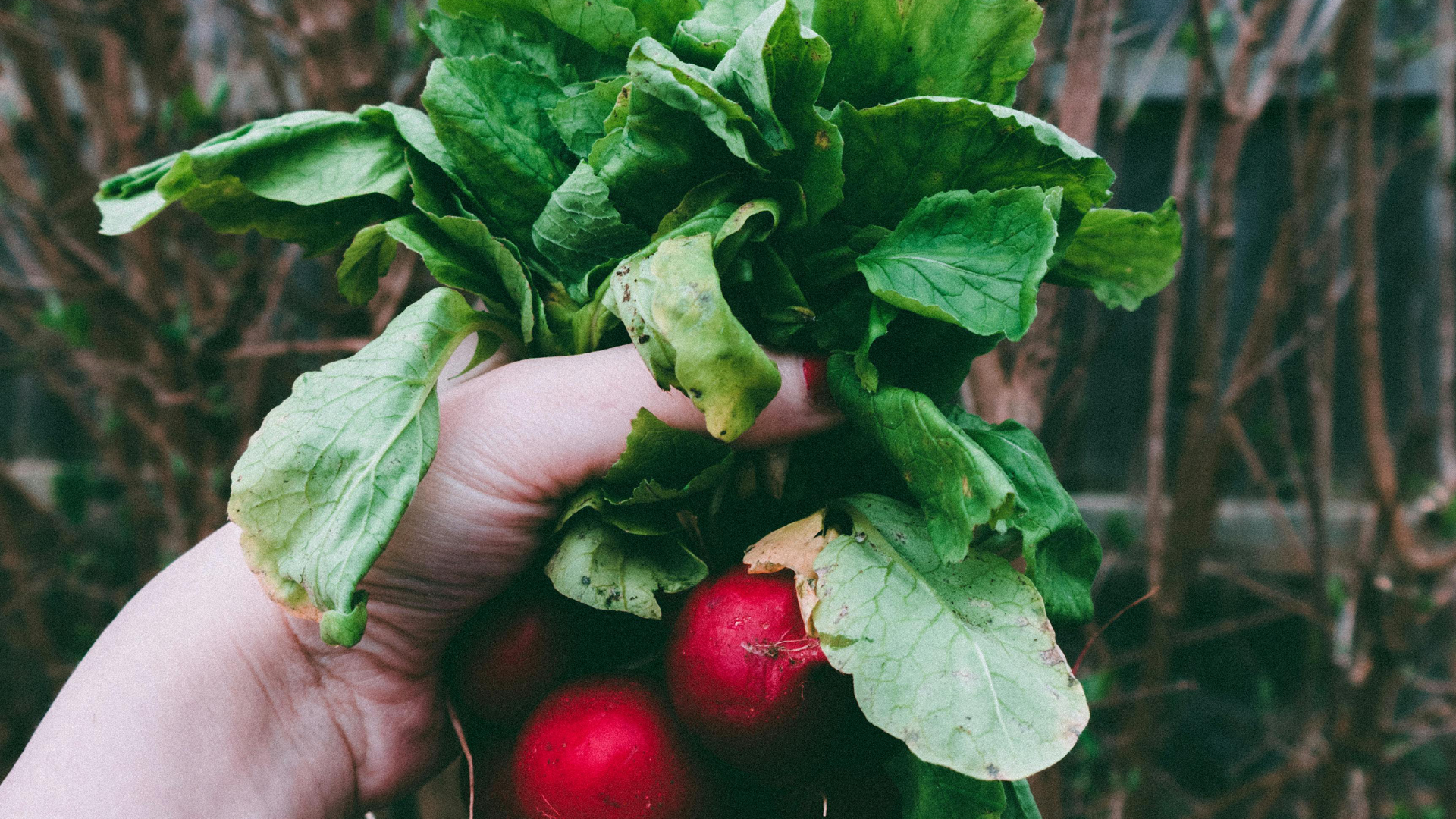
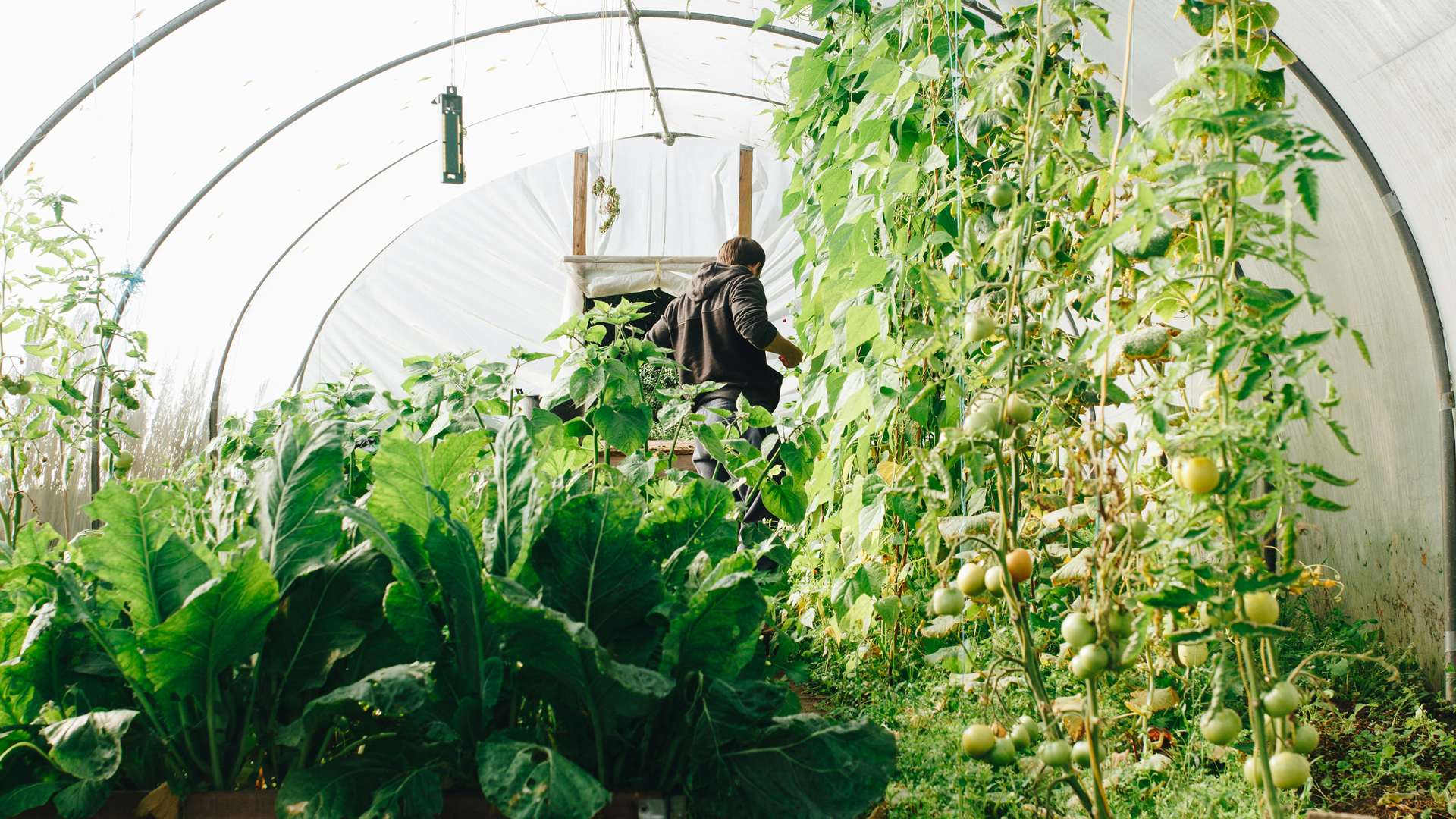
This collective grows and creates honest products straight from the soil, cultivated with care, patience, and respect for nature. Every seed, every harvest, every jar of produce tells a story of craftsmanship and connection. No chemicals, no shortcuts, no empty promises — just the real taste of nature, shaped by human hands and ecological values.
It’s not just about growing food, it’s about growing meaning. Eden celebrates the cycle of the earth: raw, real, and endlessly inspiring. A brand that feels like fresh air — simple, calm, and full of life.
The brief
The founders of Eden approached me with a clear mission: to translate their philosophy of ecological cultivation into a visual identity that felt as natural and sincere as the work they do.
They wanted to show that sustainability doesn’t have to look dull; it can be modern, fresh, and full of character. The challenge was to create a design system that reflects both the grounded roots of their work and the quiet sophistication of their vision.
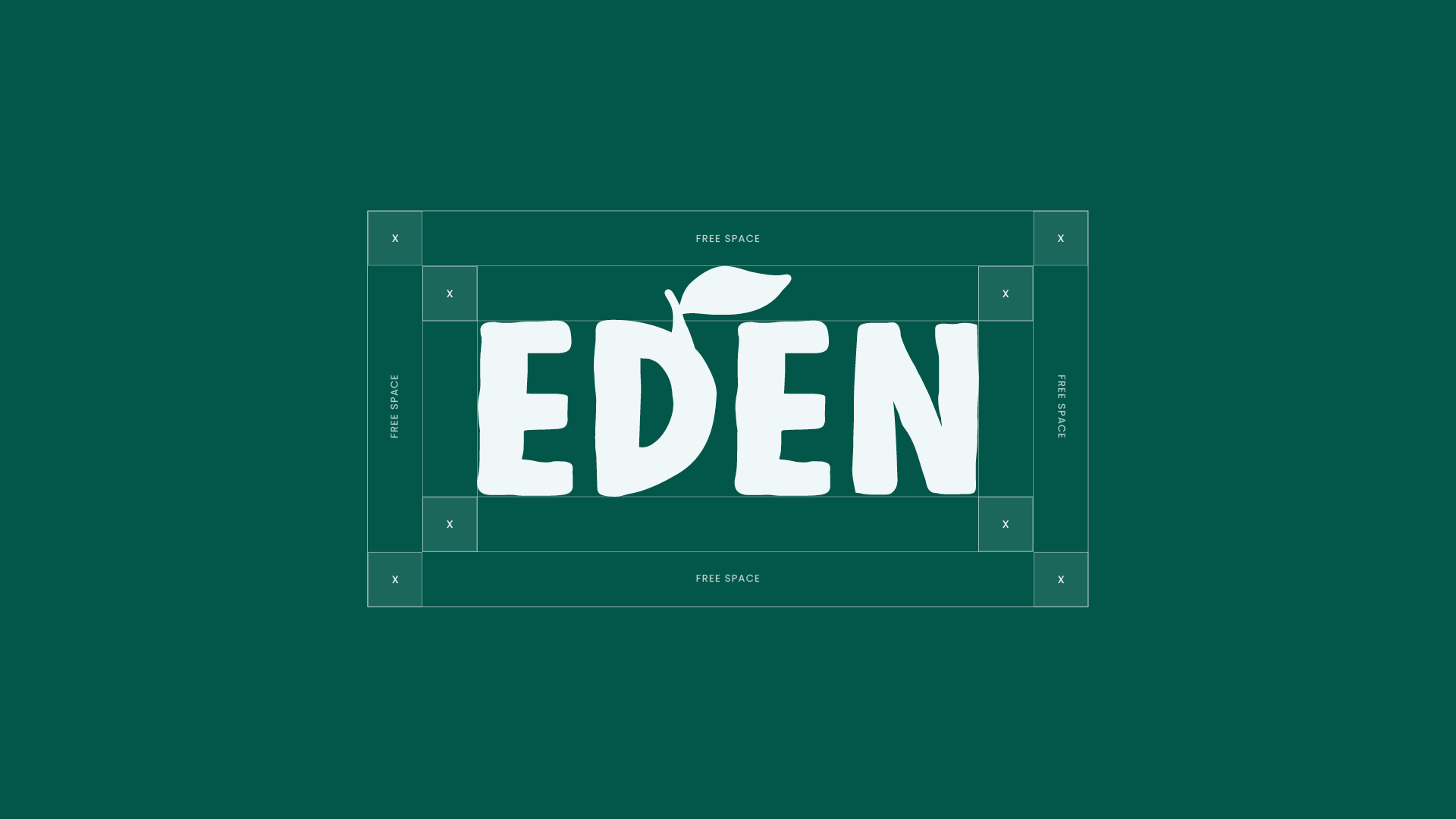
From logo to packaging, Eden needed an identity that communicates authenticity — one that grows organically, just like the products themselves.
Strategy
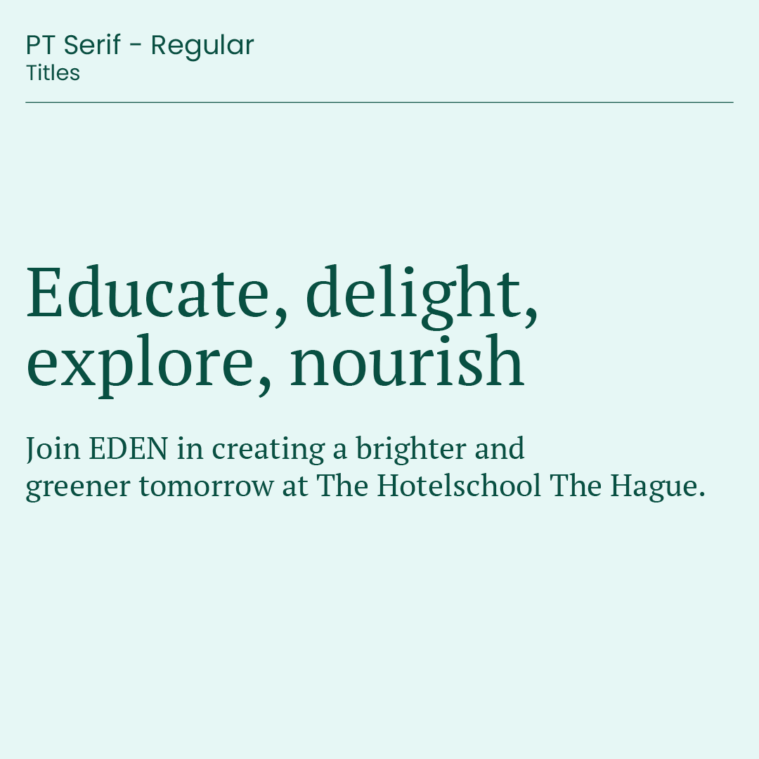
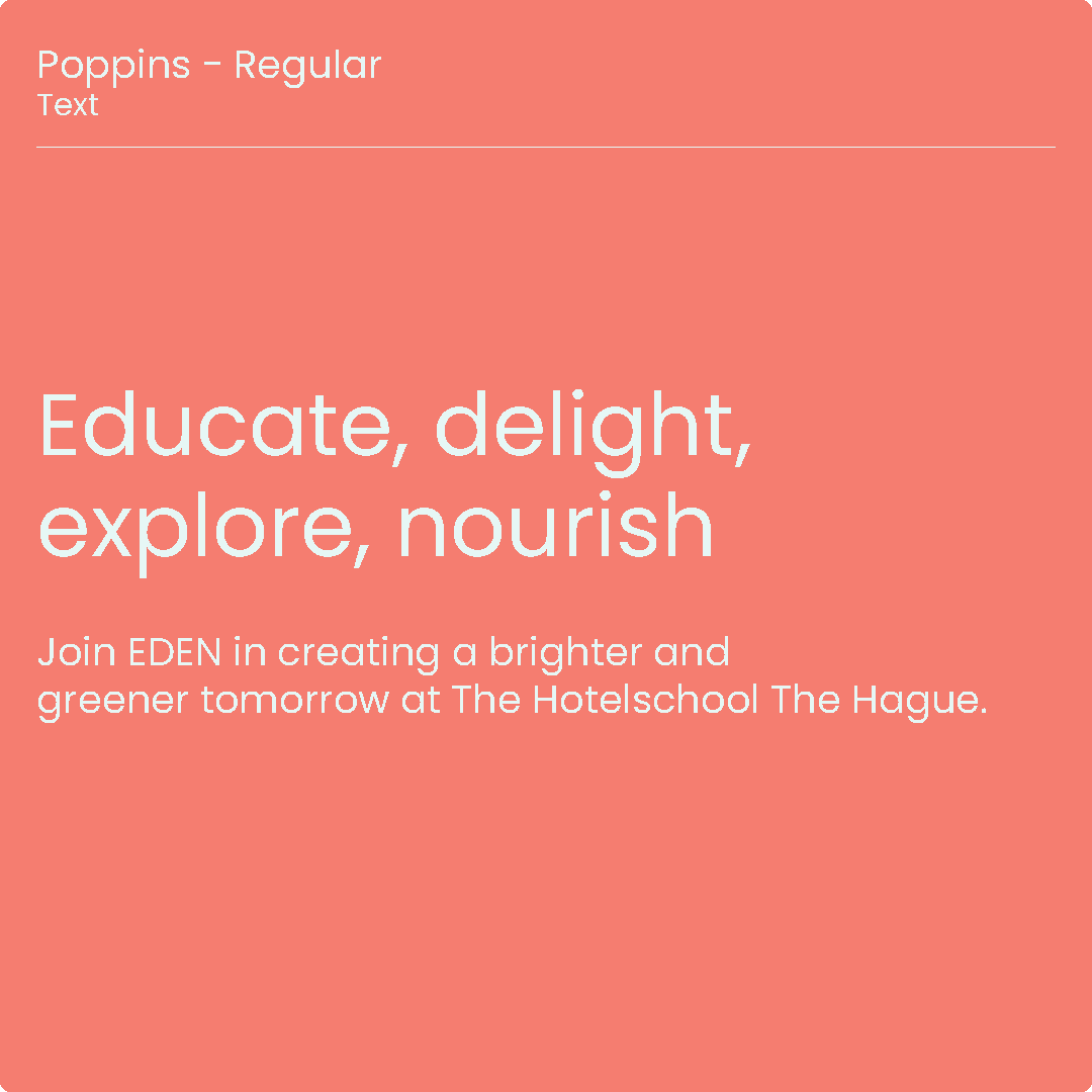
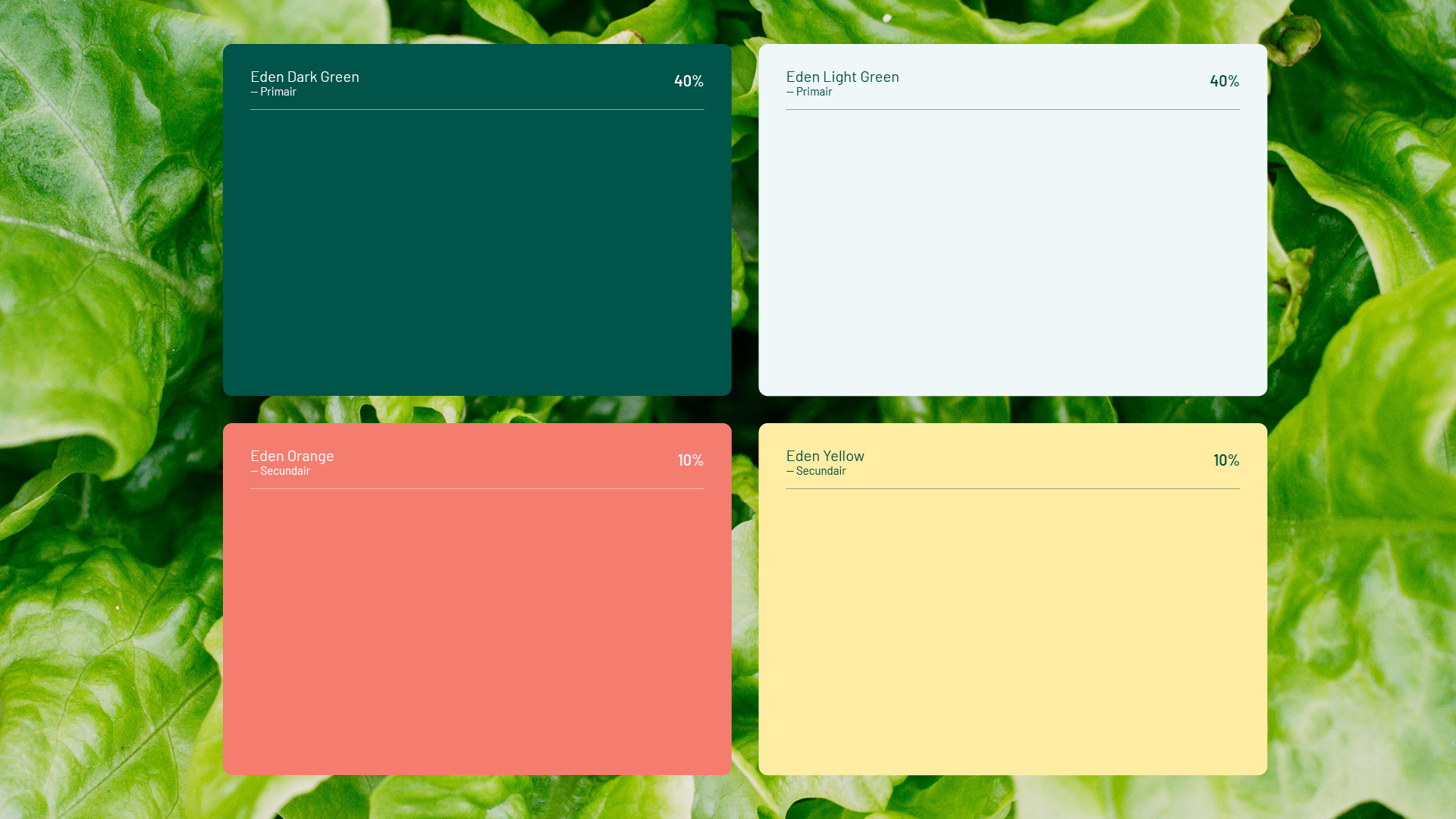
At the heart of Eden lies balance between earth and design, simplicity and expression. The strategy was to let the natural story of the brand guide every visual decision. We chose a minimal yet tactile approach: warm, earthy tones paired with clean typography and subtle, organic shapes. The tone is calm but confident, speaking softly yet leaving a strong impression.
The identity had to breathe. It needed space, honesty, and a sense of rhythm — much like a garden itself. Every element, from print to digital, was designed to feel natural, timeless, and full of quiet energy.
Process
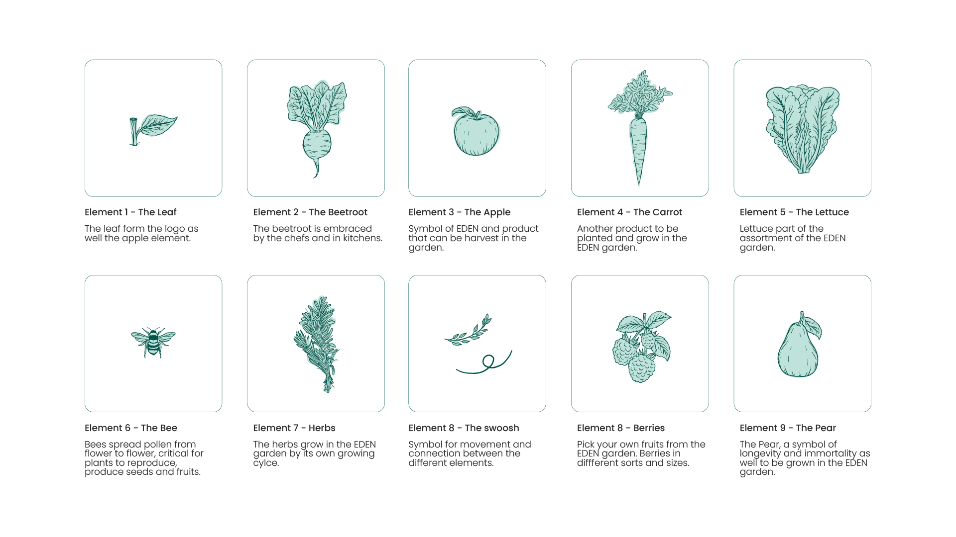
The creative process started by exploring visual textures from nature — soil, leaves, light. These became the foundation for the brand’s aesthetic language.
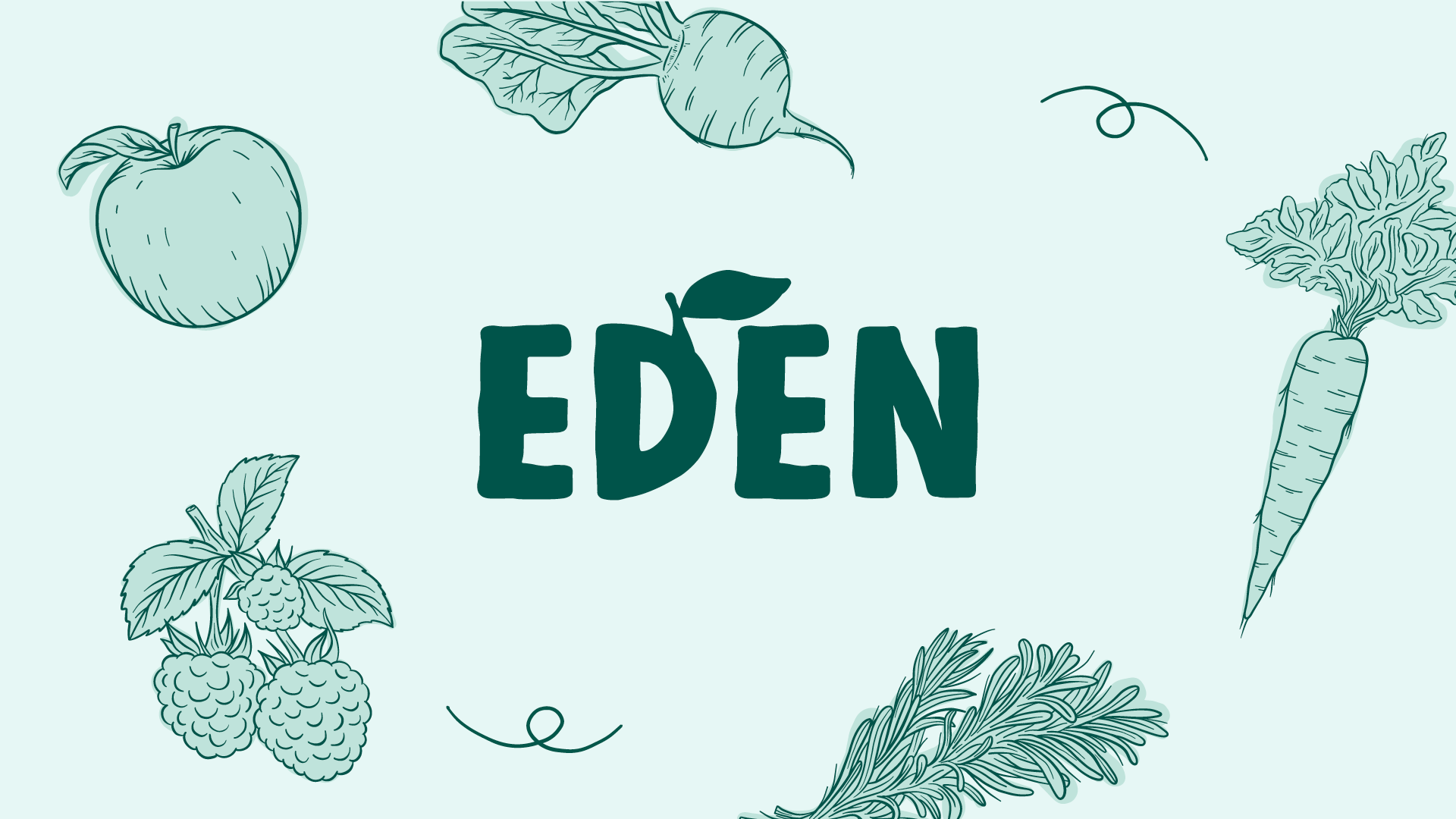
I developed moodboards that blended ecology with modern design, created a custom wordmark that feels both crafted and refined, and built a color palette drawn directly from the garden: muted greens, clay browns, and soft neutrals.
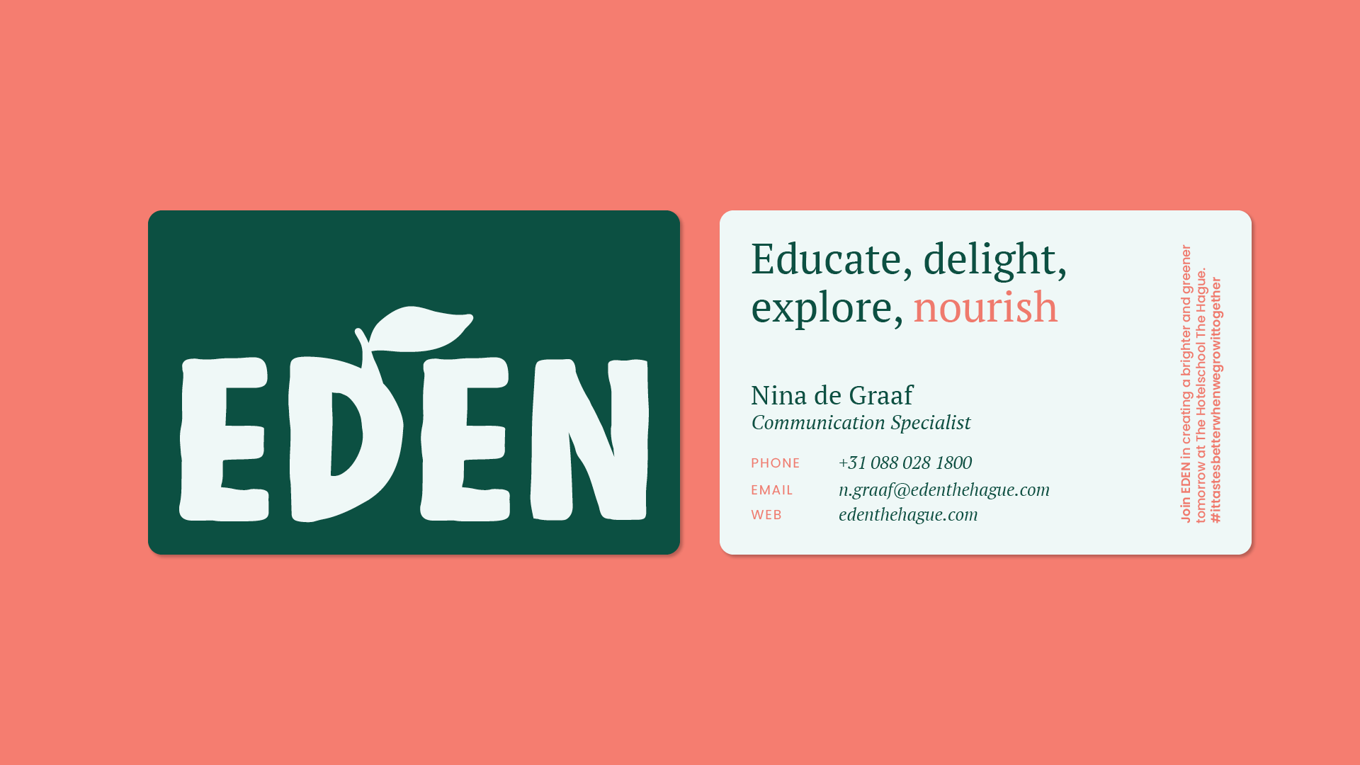
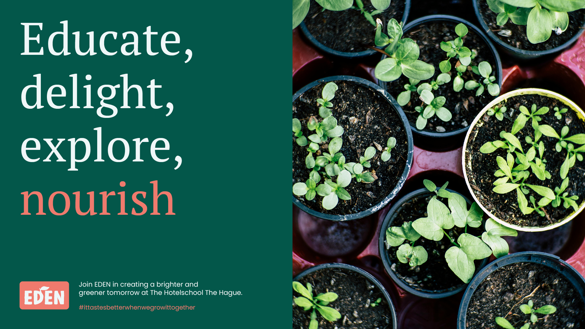
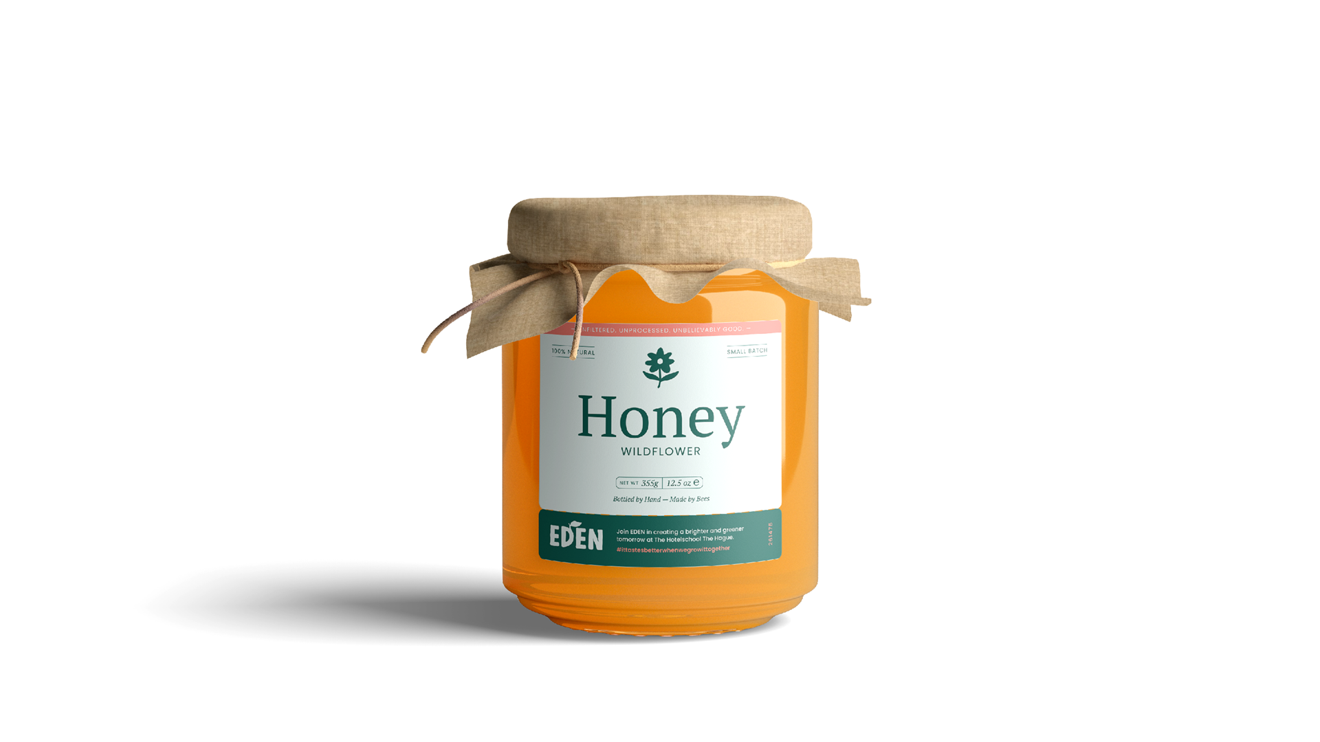
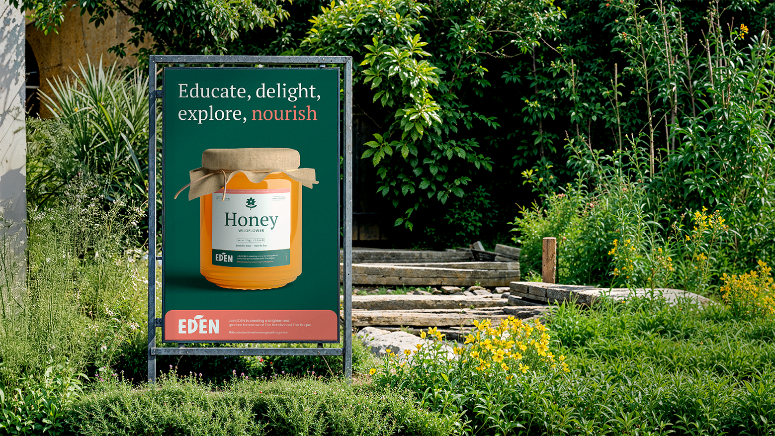
From there, we designed packaging that felt tactile and honest, social templates that told Eden’s story visually, and collateral like business cards and signage that extended the brand’s calm confidence. Every detail was made to reflect Eden’s roots: authentic, grounded, and pure.
Results
Eden now stands as a brand that feels alive and deeply human. The visual identity captures the essence of ecological craftsmanship — simple yet rich, understated yet memorable. It connects the brand’s natural origins with a contemporary visual voice, ready to grow and evolve as Eden expands.
The result is more than a design system; it’s a reflection of a philosophy. Eden proves that sustainability and style can coexist beautifully, creating a brand that feels as nourishing as the world it helps cultivate.