AI Utrecht Region is more than a technology network. It is a place where people, knowledge, and innovation come together to make AI understandable, responsible, and human-centred. The region positions itself as a leading hotspot for AI applications with societal impact, with a strong focus on Health, Sustainability, and Digital Technology.
At its core, the brand is about connection. Between companies, research institutions, and governments. Between theory and practice. Between technology and humanity. AI Utrecht Region shows that AI can be innovative and powerful, while remaining accessible, trustworthy, and optimistic.
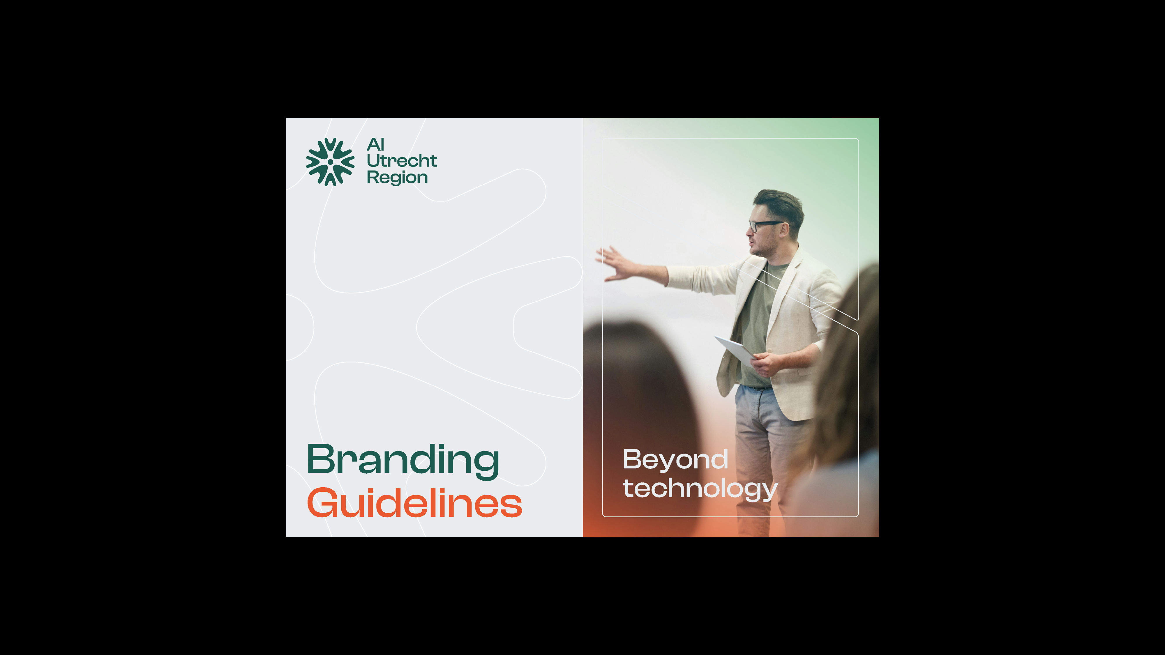
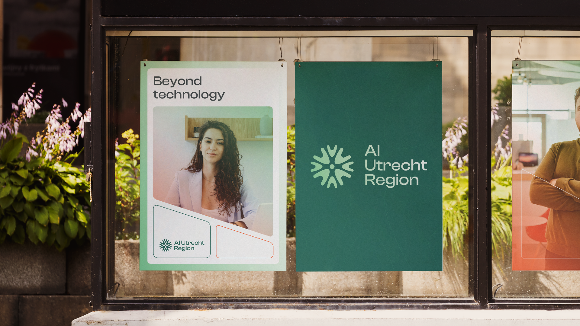
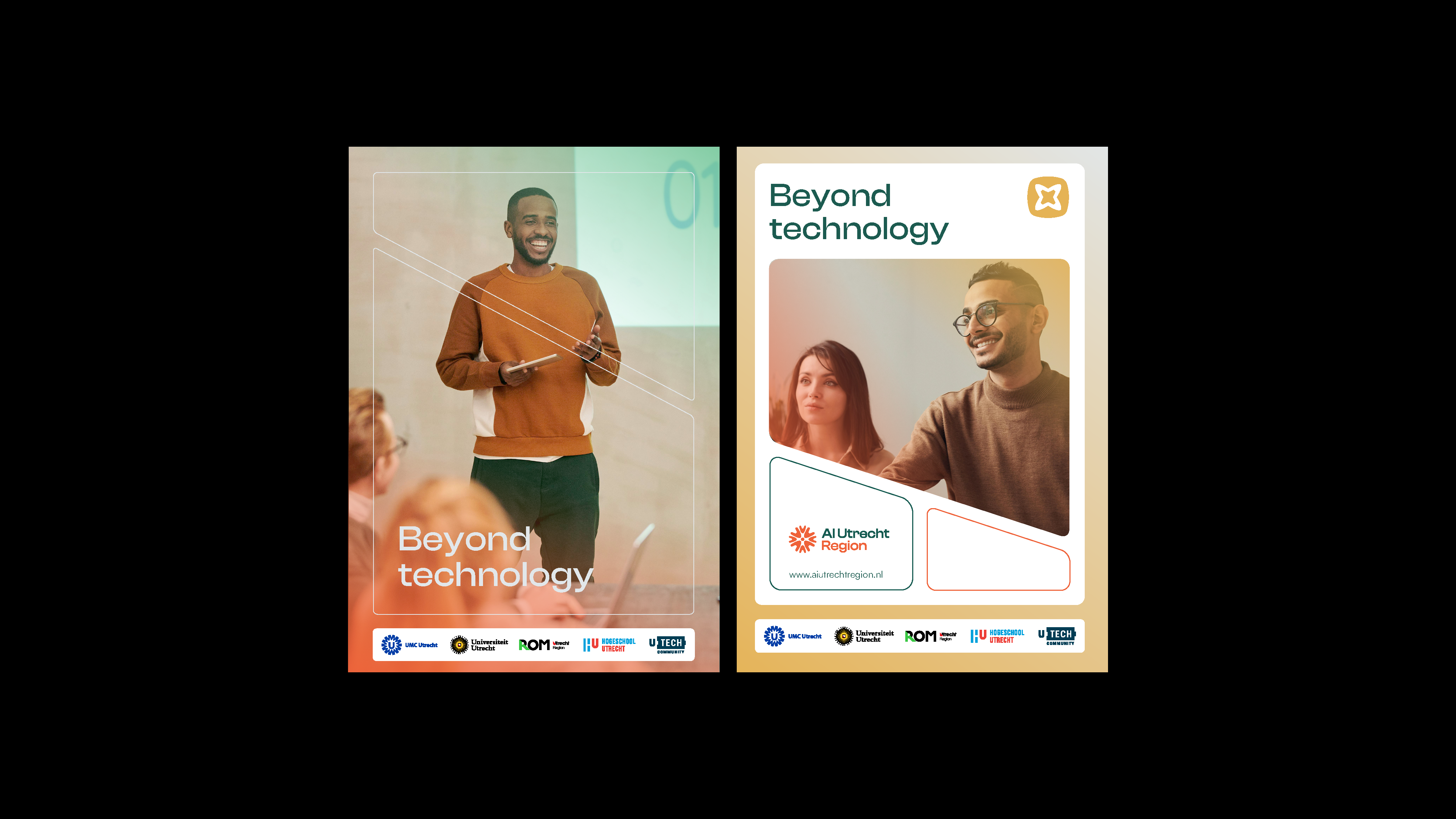
Beyond technology means looking past the code—and focusing on what AI can truly mean for people and society.
The brief
AI Hub Midden Nederland, part of the Dutch AI Coalition, set out to make the region’s AI ecosystem more visible, recognisable, and cohesive. The ambition was not to create a purely technical story, but a brand that feels open, human, and inviting—one that actively encourages collaboration and knowledge sharing.
The challenge was to develop a clear and flexible brand identity for AI Utrecht Region. An identity that builds trust in a fast-moving technological field, while remaining approachable and warm. The brand needed to function across events, partnerships, and digital platforms, and stand out within a complex landscape of stakeholders and existing visual identities.
Strategy
At the heart of the strategy lies balance. AI Utrecht Region operates at the intersection of advanced technology and human values. This tension became the foundation of the brand concept.
The positioning Beyond technology captures this mindset. AI is not the goal in itself, but a tool for progress and societal impact. The strategy focuses on connecting people and initiatives, sharing knowledge, and accelerating collaboration within the regional ecosystem. Optimism and reliability play a central role: the brand needed to feel energetic and forward-looking, while remaining credible and trustworthy.
Process
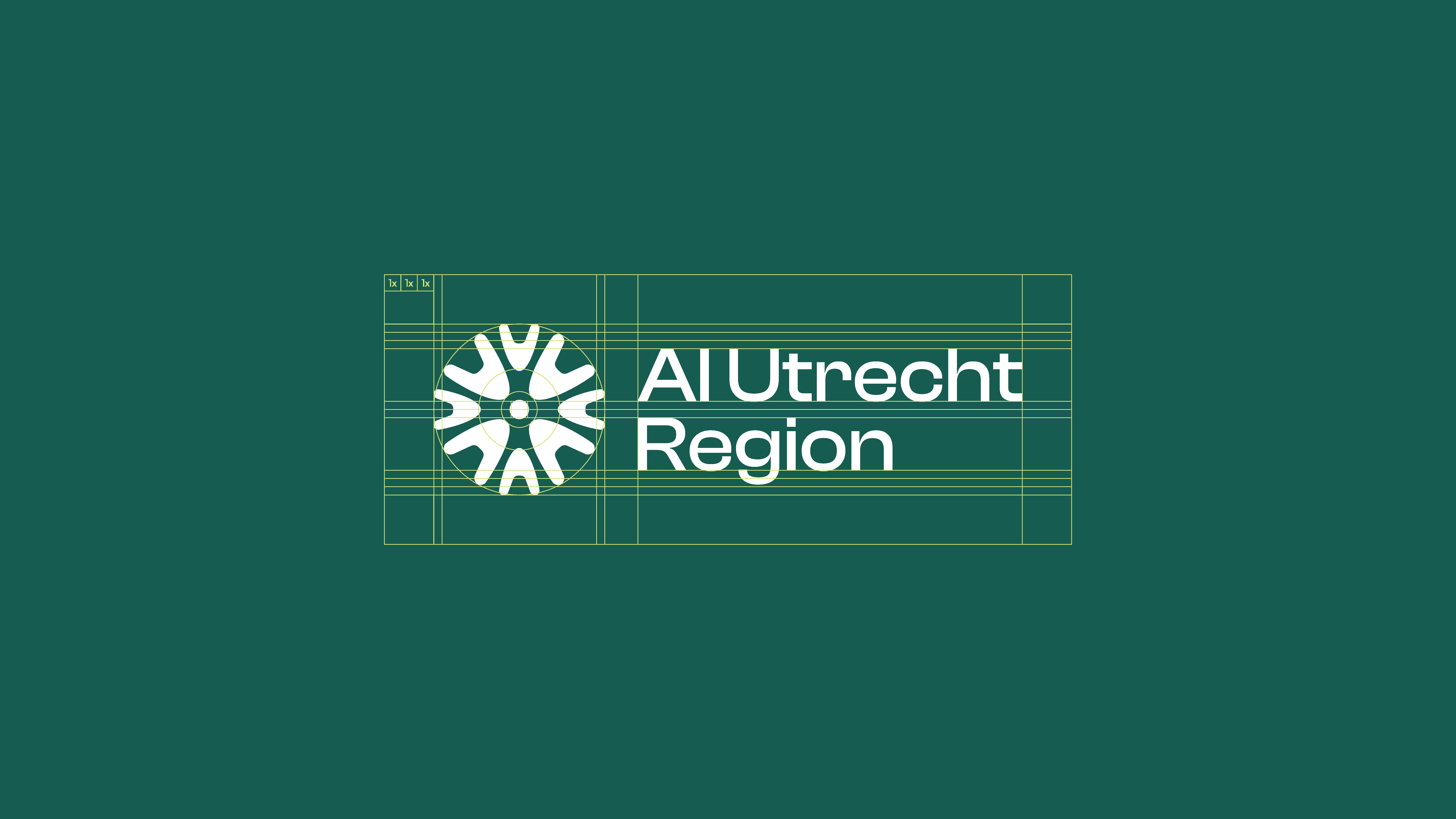
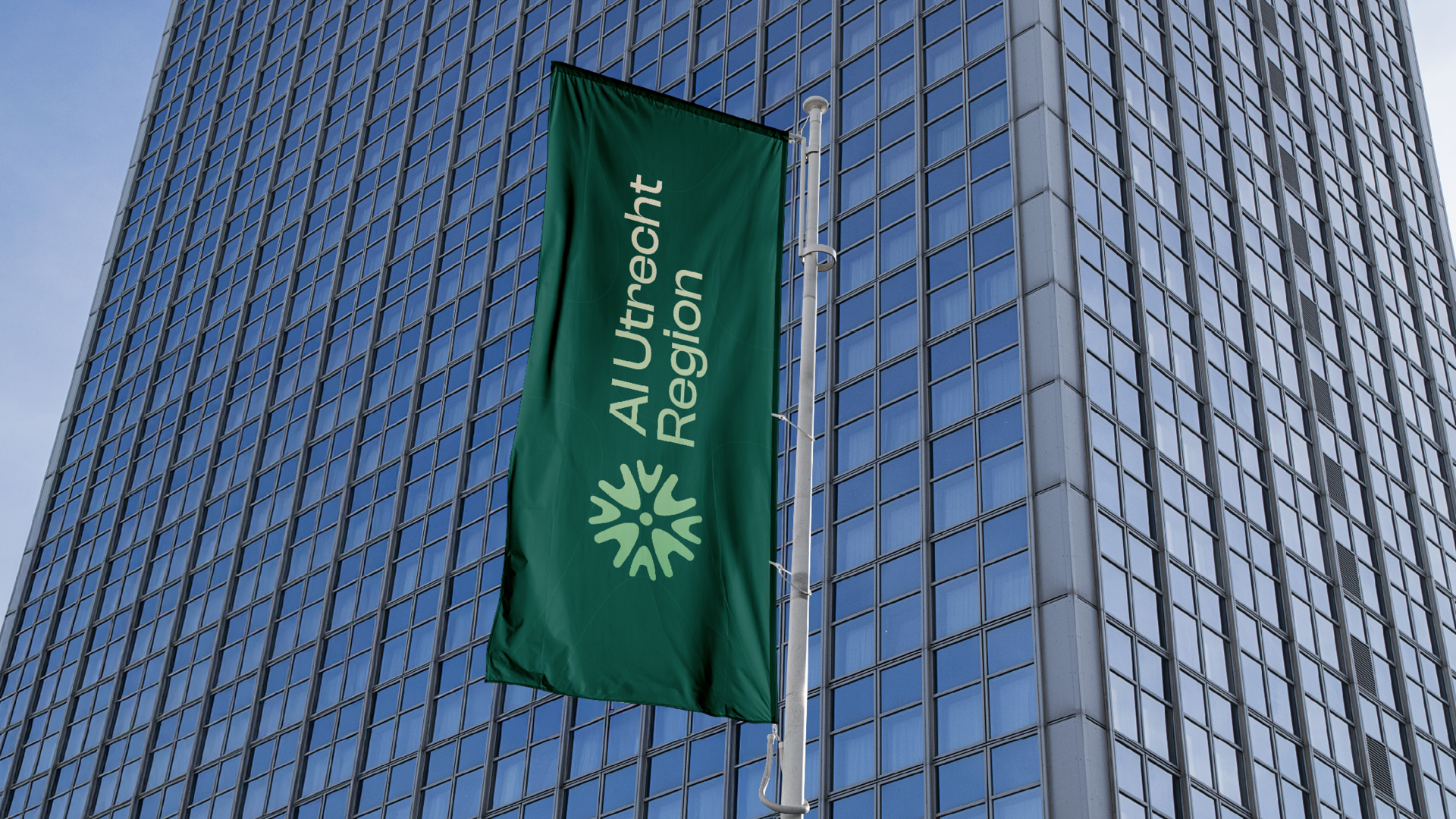
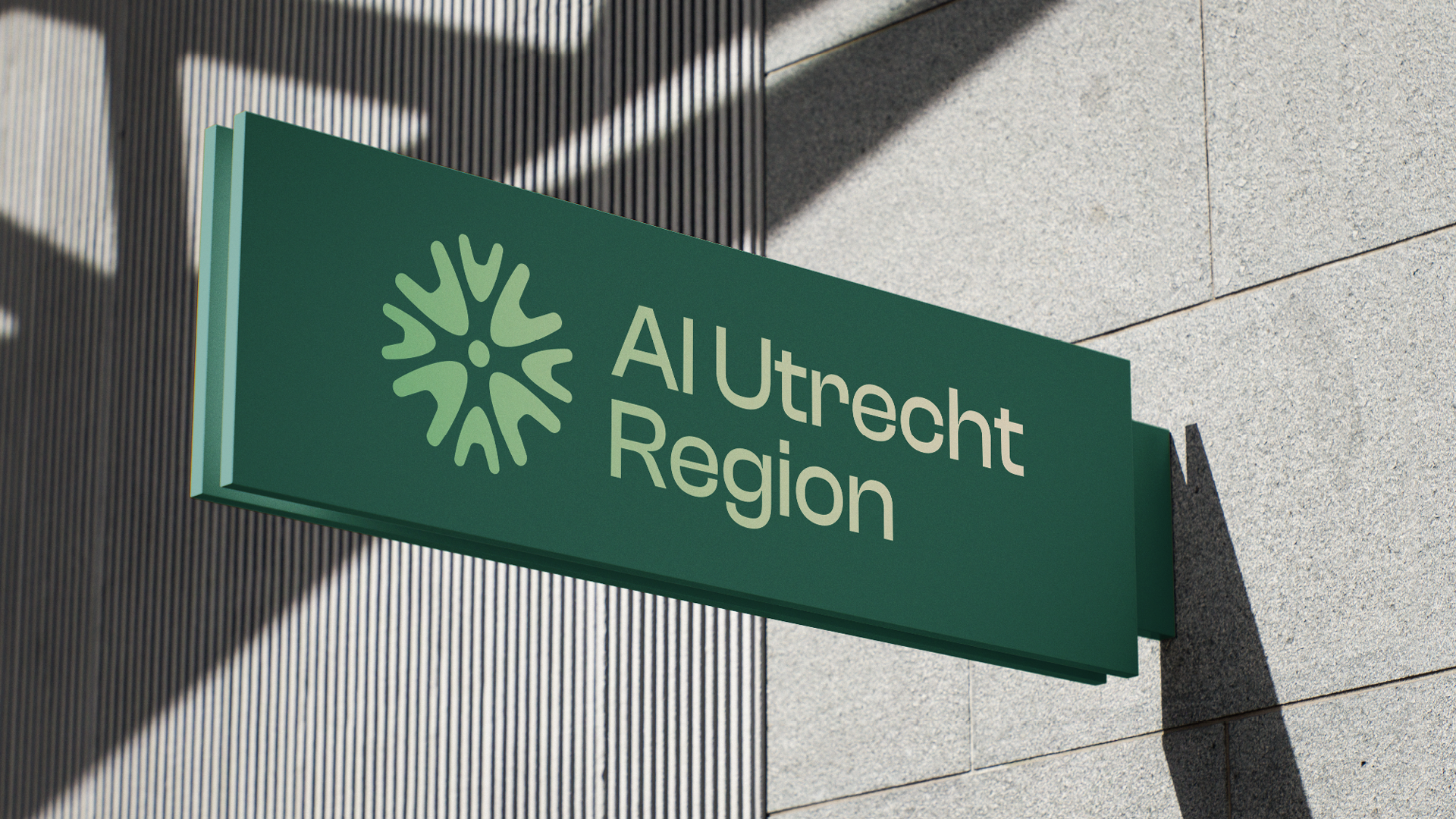
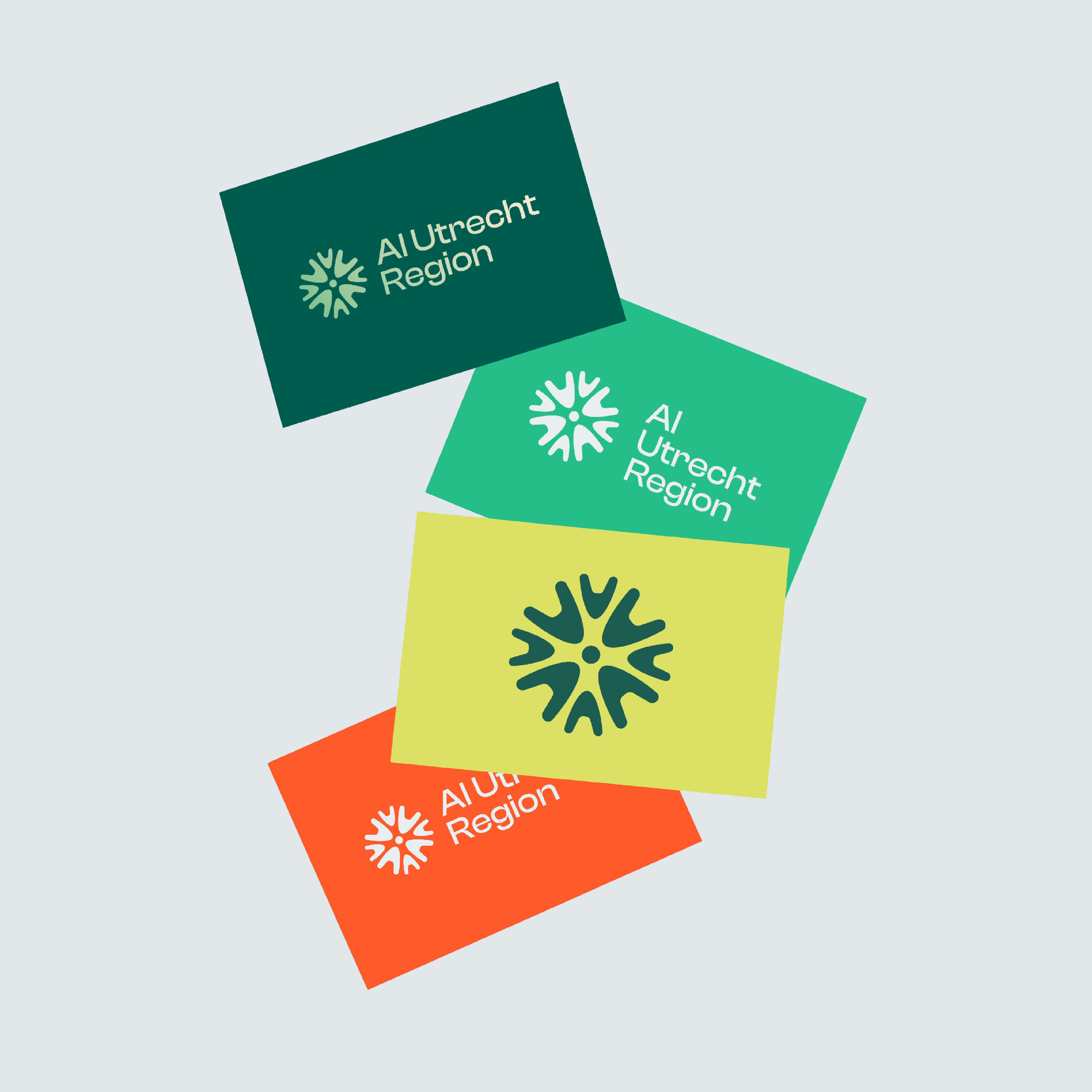
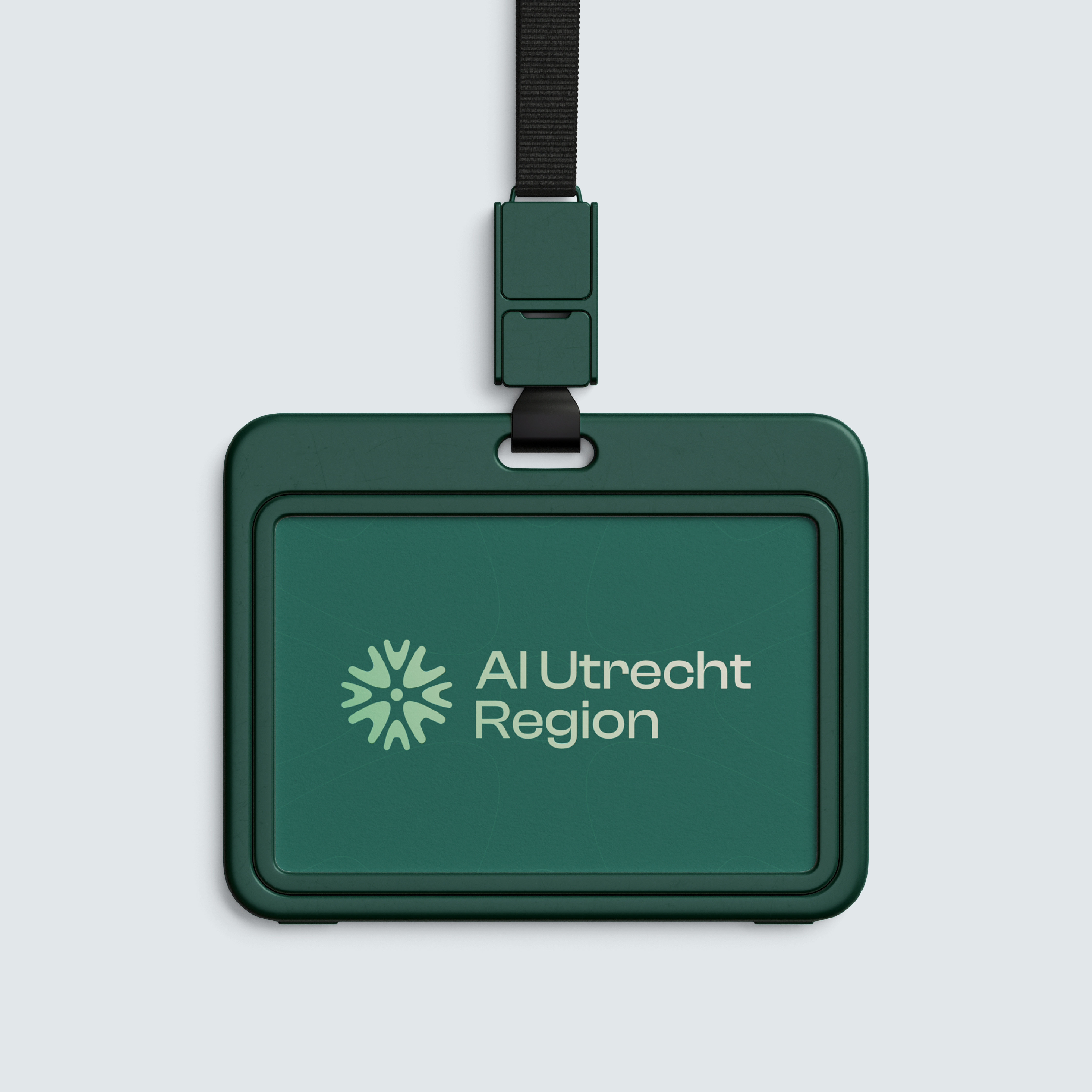
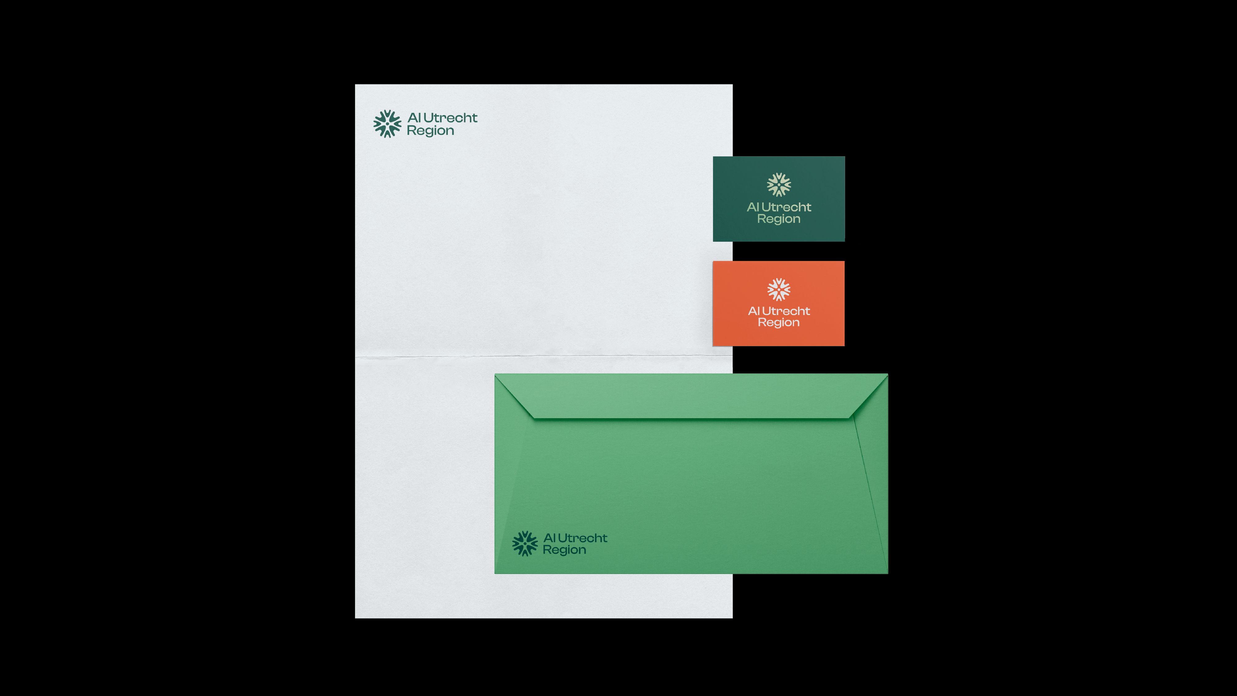
The creative process started with a deep dive into the mission, vision, and core values of AI Utrecht Region. From there, a visual language was developed that softens technology and puts people first. The logo is built from the letters A and I, shaped into a human figure that symbolises connection, interaction, and collaboration.
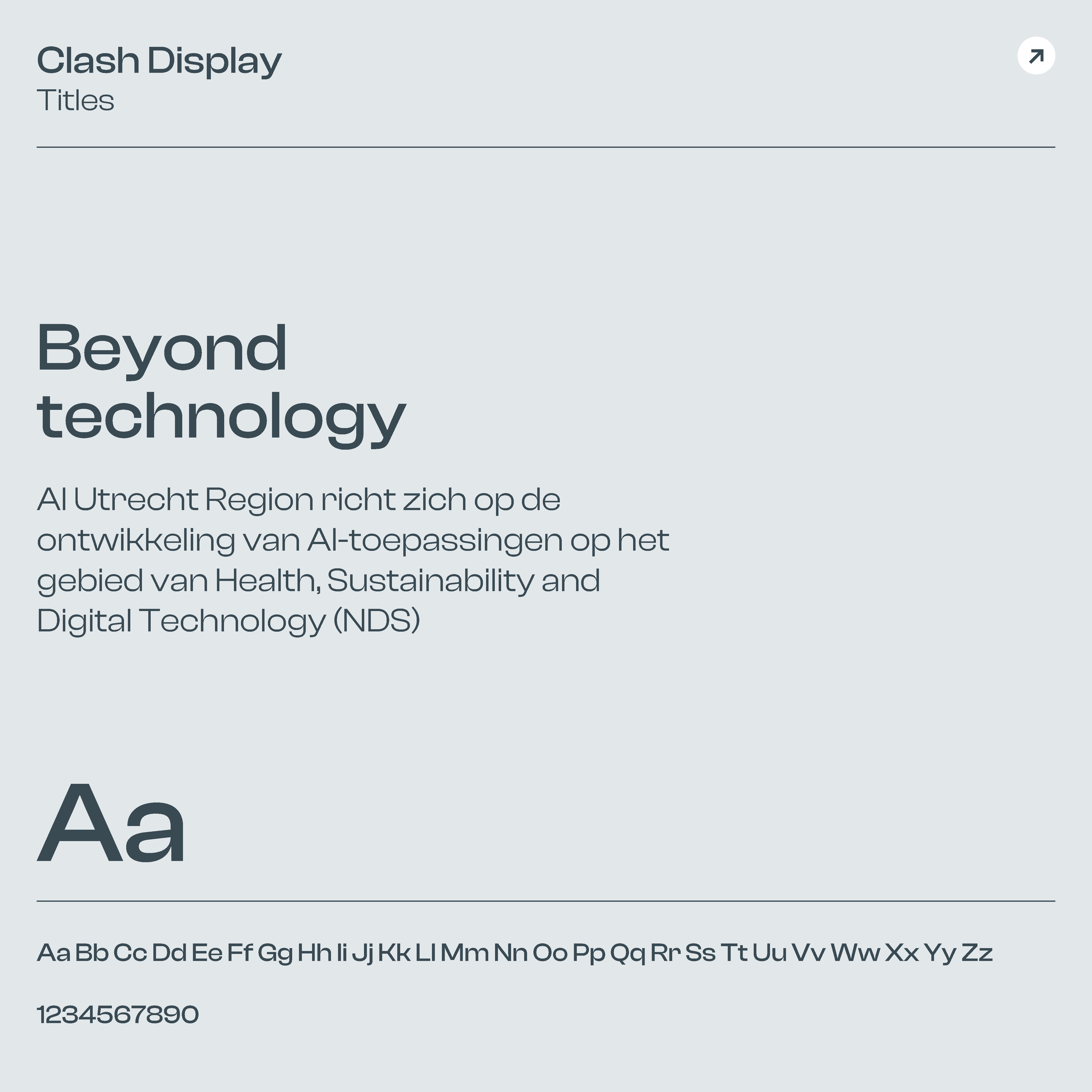
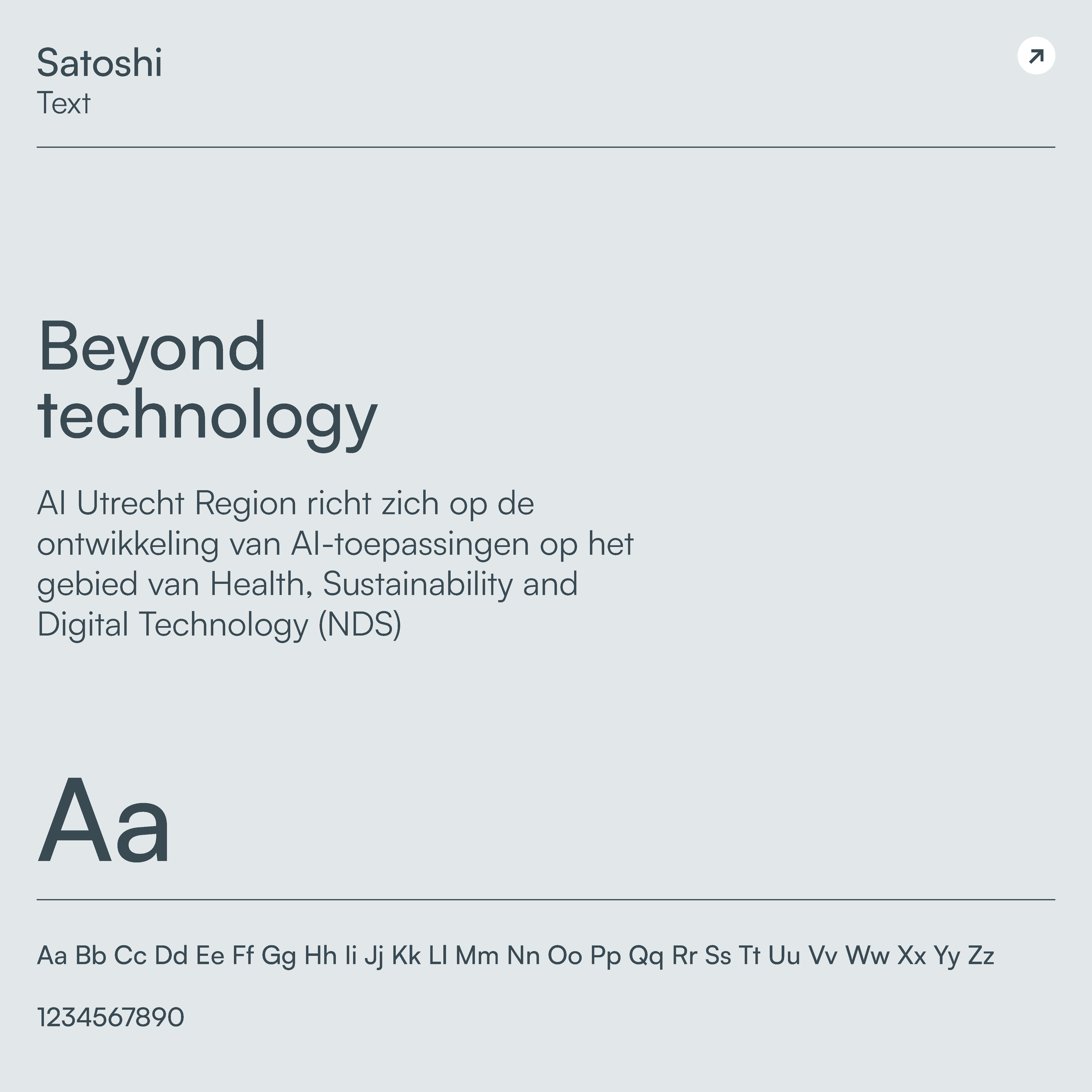
Colour and form were carefully chosen to support this narrative. Light blue creates a sense of calm and openness, orange adds warmth and humanity, and green reinforces the sustainable and innovative character of the region. The typography balances expression and clarity: distinctive, forward-looking headlines paired with clean, readable body text.
The result is a flexible and consistent visual system that can be applied across events, publications, digital channels, and partner communications.
Results
AI Utrecht Region now has a strong, recognisable brand identity that brings content and character together. The brand clearly communicates its purpose: advancing responsible and innovative AI with real societal impact—driven by people.
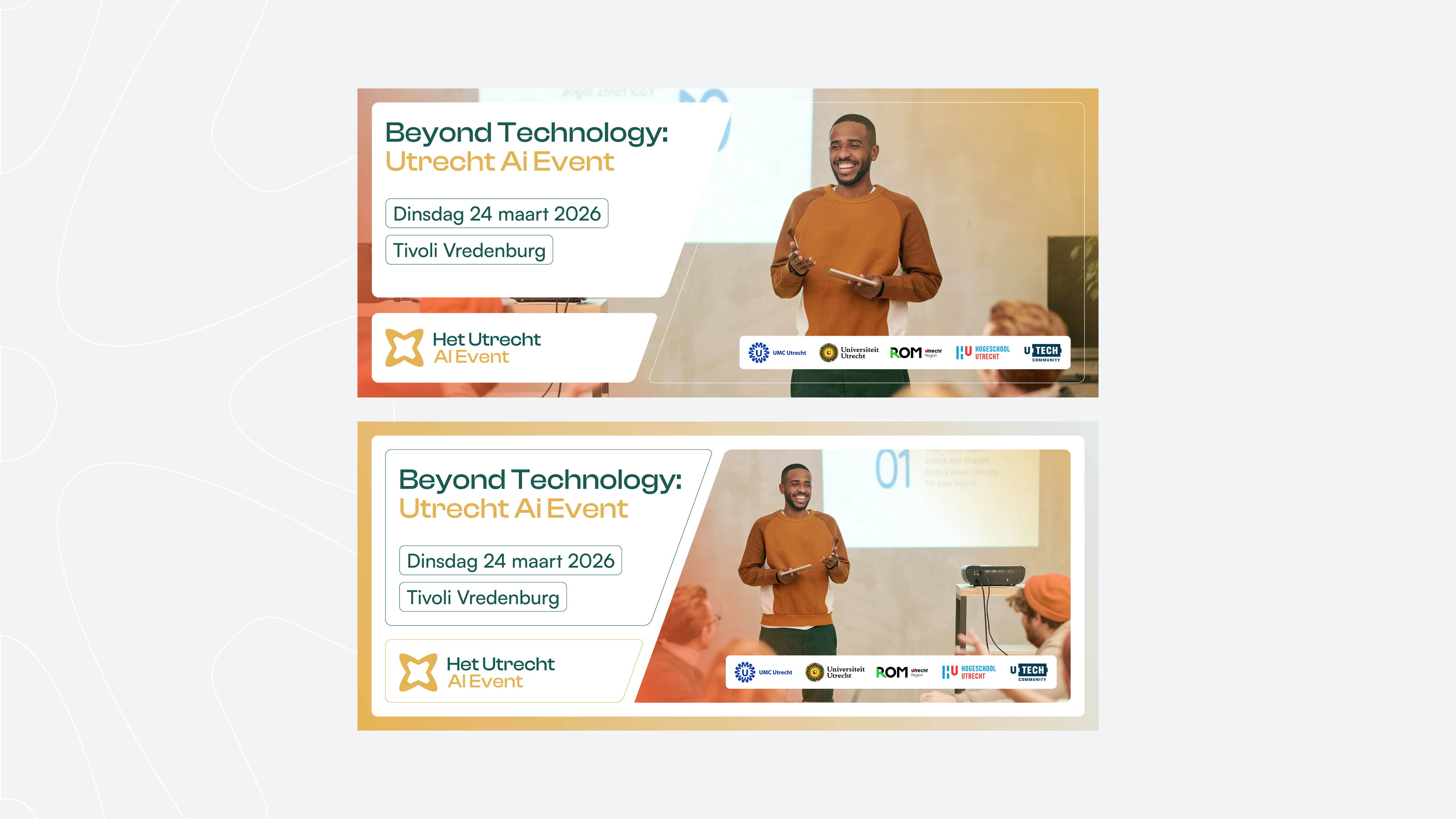
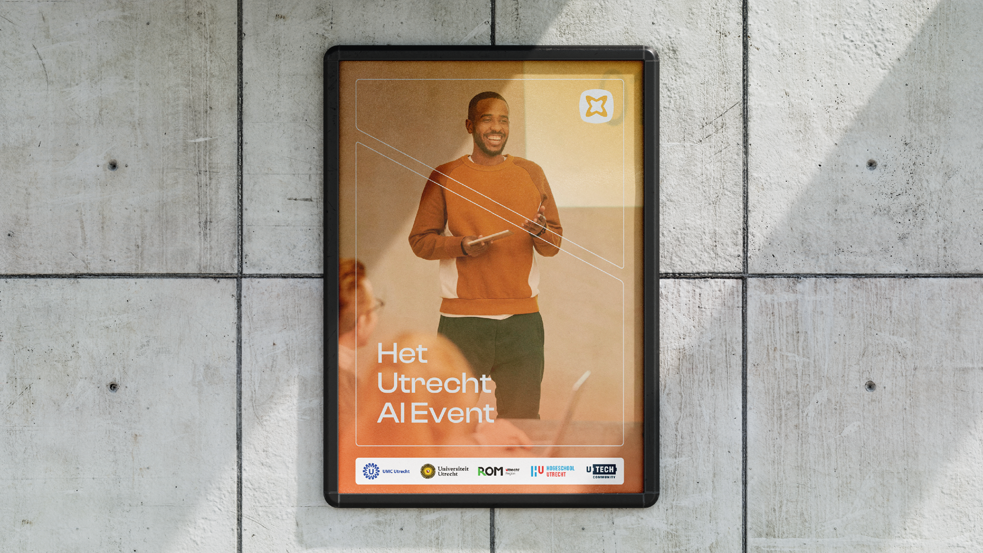
The identity is designed to grow alongside the ecosystem. From knowledge sharing and matchmaking to flagship events such as the AI Utrecht Region Event – Beyond Technology. With a clear visual and verbal language, AI Utrecht Region has established a confident, accessible presence within the regional and national AI landscape.
The brand delivers on its promise: connecting people, inspiring collaboration, and making AI meaningful—far beyond technology.